

No matter how clean a site’s images look or how impressive its animations, if it doesn’t point out what the company offers or where users are supposed to go, then it falls short. Visitors should be able to understand the basics without having to search through the page for answers. A good-looking page is nice, but a page that makes sense to the person using it is better.
The first few seconds on a homepage matter. Visitors should be able to get a feel for the business, understand what’s being offered, and see an obvious next step without having to think too hard about it. What should they notice first? What information do they need right away? Which details can wait until they’ve explored a little further?
Those decisions are what separate a homepage that simply looks good from one that actually works. In this article, we’ll look at how leading web design companies approach homepage layouts and the reasoning that goes into building a page around the people who will actually use it.
The Best Layouts Start With the Visitor, Not the Screen
There are plenty of ways to lay out a homepage. A designer might choose a split hero, a row of cards, a large image, or a more traditional grid. Whatever layout a designer chooses, visitors should be able to find what they need without having to dig through the page.
However, a homepage can also become crowded when different teams push to have their own content featured. Marketing wants the latest campaign featured. Sales wants a prominent contact button. The product wants to showcase a new feature. Leadership wants the brand message front and center. Before long, the page starts reflecting what the company wants to say instead of what visitors actually came there to find.
The UK government’s design principles take a similarly user-focused approach, putting “start with user needs” first and recommending that teams do less and make the hard work of simplifying the experience part of the design process.
For anyone evaluating a web design agency, this is worth paying attention to. A good agency should be asking about customers and their tasks before talking at length about visual style.
The Hero Section Has a Job To Do
BeforA homepage can have a great-looking image and headline at the top and still leave visitors confused. “Building a Better Tomorrow” may sound good, but it doesn’t tell someone what the company actually does. Visitors shouldn’t have to guess.
The hero section should make the basics clear right away. What does the business offer? Who is it for? The message needs to tell them why they should keep going. The hero section might highlight a product, explain a service, point out a benefit, or lead visitors to something important, such as booking a consultation, viewing a product, or learning more. What matters is that people can quickly understand why they’re there and where to go from there.
The right content will vary. A software company may need a product demonstration or interface screenshot. A law firm may need to establish its areas of practice and location. An online retailer may need to introduce its product range and make browsing easy. There is no universal hero formula. What matters is whether the first section helps a new visitor understand the business.
Navigation Should Help People Decide Where To Go
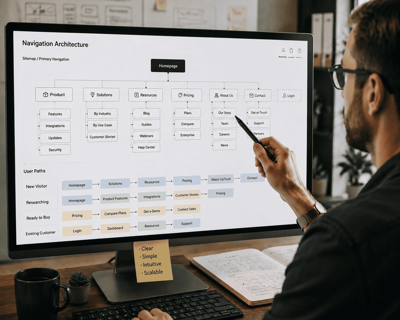
A homepage needs to give visitors sensible paths into the rest of the site. This is particularly clear in ecommerce. Baymard Institute’s research on homepage and category navigation found that the homepage remains an important starting point and navigational anchor, even though many shoppers arrive directly on product or category pages. Its research also emphasizes making the main routes to products clear through navigation, search, and curated paths.
That changes how an agency should think about the header. The labels need to make sense to the people using them, and the overall structure should help visitors predict where a click will take them.
This is one area where familiar patterns can be useful. GOV.UK, for example, provides a standardized header component designed to identify the service and give users access to site wide tools. Its design system also provides established guidance for page structure, navigation, spacing, and other common interface elements. For most businesses, there is little value in making navigation unusual just for the sake of being different.
Good Homepage Layouts Show Enough, But Not Everything
One of the harder decisions in homepage design is deciding how much content belongs on the page. Too little information and visitors may not understand the company or its offerings. Too much, and the homepage becomes a long sales brochure with competing messages at every turn.
Baymard’s ecommerce research illustrates why this balance matters. Its research found that some users misunderstood an ecommerce site’s product range when the homepage showed too narrow a selection of product types. The issue wasn’t simply visual appeal. Visitors were using the homepage to form an understanding of what the store actually sold. That doesn’t mean a business should display every product, service, or piece of content it has.
The better approach is to choose representative examples. A consulting firm might highlight several areas of expertise. A retailer might show different product categories. A software company might introduce its main features through actual interface examples rather than generic icons. The visitor gets enough information to understand the business without being asked to read the entire site from the homepage.
Responsive Design Changes The Layout, Not The Message
Instead A desktop homepage can have plenty of room for side-by-side content. On a phone, those same sections may need to stack vertically or change order. That is why responsive design needs to be considered during the layout process rather than treated as a development task at the end.
The W3C’s WCAG guidance requires content to reflow without loss of information or functionality at narrow viewport sizes, with specific requirements around avoiding two-dimensional scrolling for most content. Its guidance also describes responsive layouts that adjust columns and layout regions as available space changes. This matters beyond accessibility compliance.
Three cards sitting side by side can look clean and balanced on a desktop. On a phone, though, that same layout can become a completely different experience. Once the cards are stacked into a narrow column, they may feel crowded, take up too much space, or become harder to scan. A layout that works on a large screen can’t always be carried over to mobile without making some changes.
The same problem can happen with navigation. A desktop menu may be easy to scan, but putting every single link into the mobile version can leave people scrolling through a long list just to find what they need.
Mobile design often requires making different choices, not simply shrinking the desktop version. The best web design teams design the hierarchy across screen sizes. They don’t simply shrink the desktop version.
Accessibility Affects The Layout From The Start
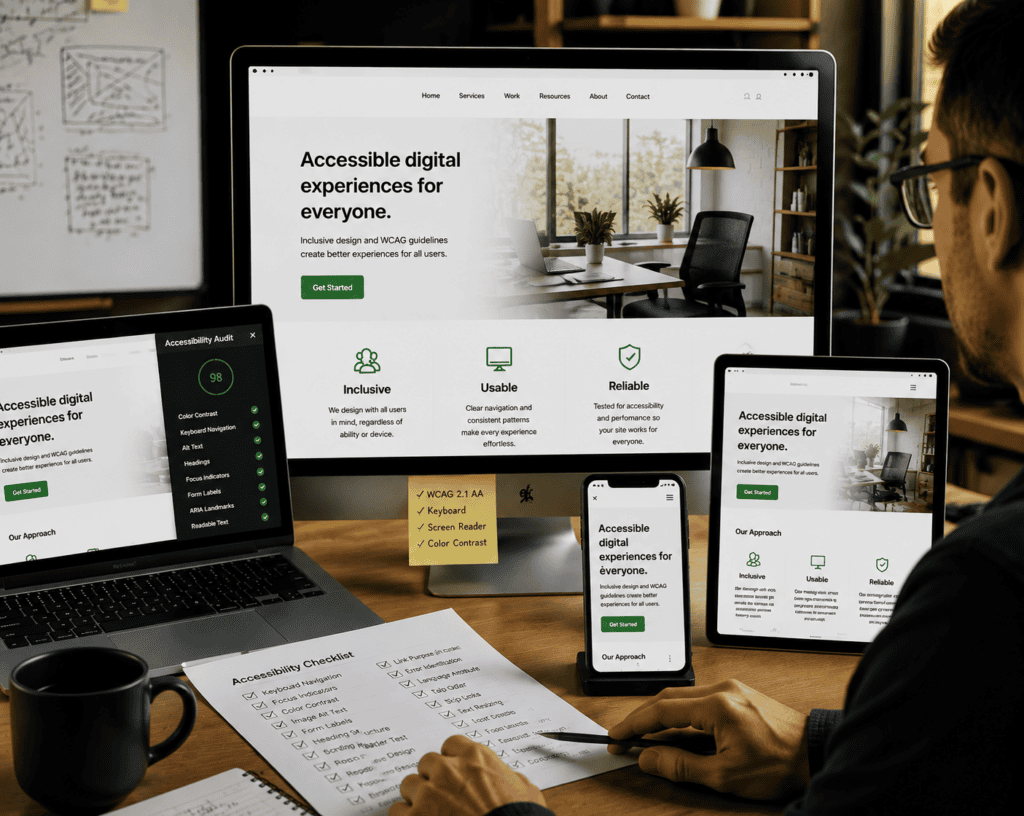
Good agencies constantly tie design choices back to user behavior. Airbnb Design Language System does not make decisions based on pIt’s much easier to make a homepage accessible when those needs are considered from the start. Leaving accessibility until the end can lead to unnecessary revisions, especially when the team has to rethink designs that have already been approved.
Some of the biggest accessibility improvements come from decisions that may seem minor at first. Is the text easy to read? Is there enough space between elements? Can people tell the difference between text and the background? Can someone move through the site using only a keyboard? Does the layout still work properly on a phone?
The GOV.UK Design System is a good example of building accessibility into the process rather than treating it as a final check.
The same thinking applies to people who need to increase the text size or zoom in. The page should remain usable and readable instead of becoming difficult to navigate when the text gets larger. Increasing the text size shouldn’t break the layout or leave someone scrolling from side to side just to get through a page. W3C’s guidance on reflow addresses this by explaining how content should adjust to different screen sizes while keeping the same information and features available.
When reviewing an agency’s homepage designs, don’t just look at the desktop version. Ask to see how the page behaves on a phone, with the text enlarged, and when you navigate without a mouse. These checks can give you a much better idea of whether accessibility was considered throughout the design process or added as an afterthought.
The Most Important Design Decision May Be What Gets Removed
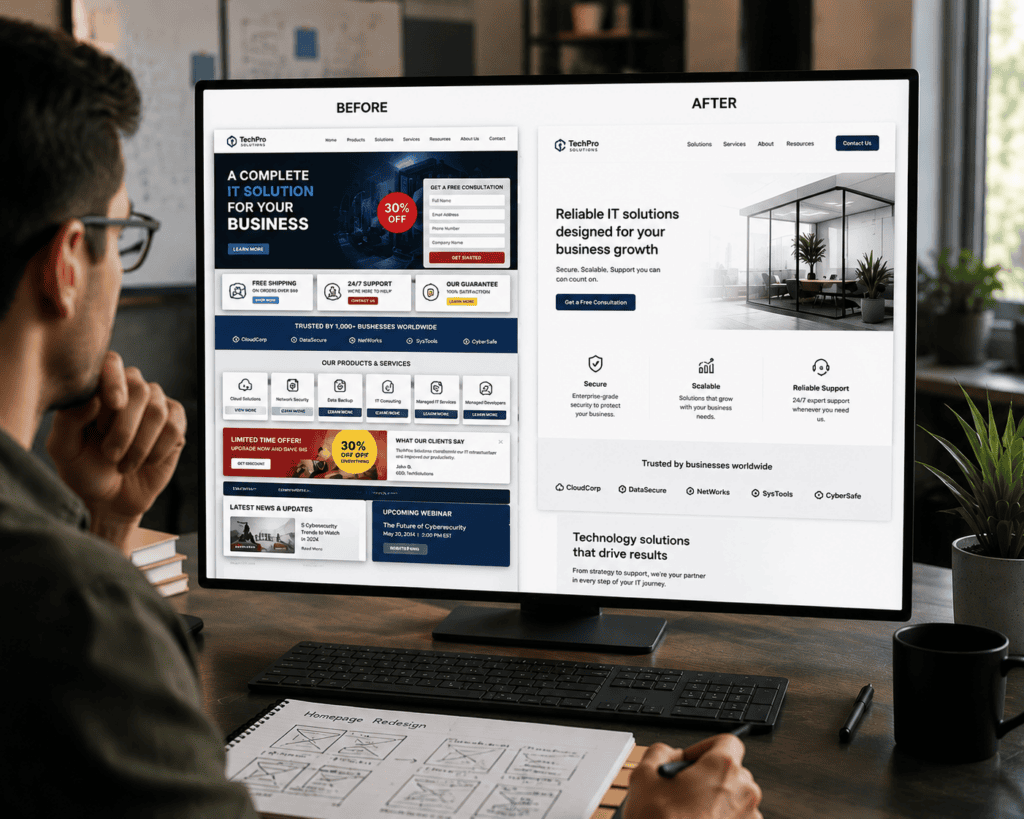
Homepage projects have a funny way of getting crowded. Marketing wants a promotional banner. Someone else wants to add a testimonial. Another team wants a newsletter signup. Then there’s another call to action, a row of company logos, and a few more sections that someone feels visitors “really need to see.”
On their own, these requests might all make sense. The problem is what happens when they’re all squeezed onto the same page. Eventually, visitors are faced with so many messages, buttons, and sections that it becomes hard to tell what actually matters.
This is where an experienced agency can make a real difference. A homepage doesn’t need to tell visitors everything about a business. Every section should have a purpose, and sometimes the best place for a piece of information is somewhere else on the site. Government design guidance takes a similar approach with its “do less” principle, encouraging teams to keep services simple and remove unnecessary complexity.
Top SEO agencies should also be comfortable pushing back when something doesn’t belong on the homepage. If every stakeholder request automatically makes its way onto the page, clutter is almost inevitable. A homepage can be visually impressive and still be overwhelming. Sometimes the best design decision is simply deciding what doesn’t need to be there.
What To Ask A Web Design Agency Before Choosing One
A portfolio is a good place to start when you’re looking at web design agencies, but it shouldn’t be the only thing you consider. A collection of polished homepages shows you the final product, but it doesn’t tell you much about the decisions that went into it.
Ask the agency why certain elements appear where they do. How did they decide what visitors should see first? Why is the navigation set up that way? What made them put certain information on the homepage instead of moving it to another part of the site? You should also ask how they handle mobile layouts and when accessibility enters the process.
Don’t be afraid to question a design choice, either. If something seems unnecessary or doesn’t make sense to you, ask the designer why it’s there. A good team should be able to explain the thinking behind the layout and what they want visitors to notice, understand, or do. “It looks modern” isn’t really an answer. You want an agency that can explain the reasoning behind its choices.
For ecommerce projects, ask whether the agency has experience with product discovery, category navigation, and homepage usability. Baymard’s research shows how many usability issues can exist in these areas, even on major ecommerce sites. Its current benchmark includes thousands of manually reviewed homepage and category-navigation elements across leading ecommerce websites.
The goal isn’t to find an agency that follows one particular homepage style. The right agency should be able to explain why a particular layout makes sense for your customers and your business. You’re not just looking for a homepage that looks impressive in a presentation. You want to know why the designer made certain choices and how those choices are supposed to help visitors.
A homepage also doesn’t need to say everything at once. It should give people an obvious place to begin, make important information easy to find, and feel straightforward to use whether they’re on a computer or a phone. It should also work for people with different needs and browsing habits.
When you’re comparing agencies, take a closer look than just their portfolios. Pay attention to how they explain their design choices and whether they can give you a clear reason for the decisions they’ve made. Good web design agencies should be able to create more than a homepage that looks polished. The page should be easy to use, make sense to visitors, and help them find what they need.
Browse our vetted list of web design agencies to find a team that can create a homepage that looks good, works well, and makes sense to the people visiting it.