
You can build a beautiful website on desktop, with a great color scheme and engaging visuals, but still fall short of your goals if your content won’t scale to a phone screen. If your site doesn’t look good or handle well on phones, people shopping from them will look for another site that does. That would be a huge detriment to your site, as online sales are increasingly trending toward mobile devices and tablets. What you need is responsive web design, but what is that, exactly? In this guide, we’re going to cover responsive web design best practices and benefits that are easy for non-developers to understand.

Definition
To start off, we’re going to cover the broad definition of what responsive web design is. Put simply, it’s an approach to web design that allows content to scale seamlessly between different screen sizes. Your site will automatically appear properly for both screens. The reason for this is that desktop screens are much larger and wider than phone screens. If you open a site that’s been purely designed for desktop on your phone, it may be difficult to navigate the site. You may need to scroll left and right or the formatting could be completely broken. With the benefits of responsive web design, you can fix that.
Why It Matters
You don’t just need to know what responsive web design is; you need to know why it matters. It matters because, without it, people can’t open websites from their phones. If they can, it will be difficult to navigate. In a world where people want the most convenient options possible and have many other alternatives, they aren’t going to stay on a poorly optimized site. They’re going to go to a site or an app that’s properly built. That can lose you a huge amount of customers, even if your products and marketing strategies are great. You want to adhere to responsive web design best practices to attract and keep those customers. Google provides a whole list of reasons why responsive web design is optimal. We’ll cover some of these reasons below.
One Site For All Devices
With an automatically scaling site, which is a large part of what responsive web design is, you can serve all potential users rather than limiting yourself to only one part of the market. This will also ensure that phone users get a better user experience. That’s something you want to pay close attention to, as 48% of users get annoyed or frustrated with websites that aren’t mobile-friendly.
Optimal Design for Each Device
By having the option to tailor the style of your site based on whatever screen dimensions you’re working with, you have more opportunities to fine-tune site design. You may have a particular idea for your site design on desktop that you don’t want to follow through on because it won’t scale to mobile. With responsive web design, you can optimize your site for both and perfect your look for each.
No Redirects
Before responsive web design best practices were in place, companies would often have two completely different sites, one for desktop and one for mobile. Mobile phones would be redirected from the desktop site to the mobile one instead. While that can be a solution, it’s much more efficient if you only have to build one site that will function optimally on all devices. One of the benefits of responsive web design is not having to put in the extra effort of building and monitoring two separate sites.
Getting Started — CSS
To gain a better understanding of what responsive web design is, you should have a basic grasp of the technologies that make it possible. Websites are built on three primary programming languages: HyperText Markup Language (HTML), Cascading Style Sheets (CSS), and JavaScript (JS). Of these, CSS is what developers use to establish the visual layout of the site. CSS defines all styling rules for site components, including colors, fonts, columns, and more. Developers can select certain site components and write rules for how they should display. It’s like using PhotoShop or Word to design a poster, except you do it through code instead of visually formatting it.
Breakpoints
In order to properly execute responsive web design on your site, you need to establish breakpoints. Breakpoints are guides you can place on the site content that will adjust how content displays when there isn’t enough room. If only one breakpoint in a horizontal line will fit, the site can automatically push the rest of the content to the following line. That way, you can have a lot of horizontal content but allow it to squeeze into vertical rows when necessary for the viewing device. Following breakpoints is one of the best practices for responsive web design that will yield the most benefits.
Media Queries
To understand what responsive web design is, you need to know media queries. Media queries allow developers to set rules for how things should appear at different screen sizes. For example, if you want your text to be smaller on phones, you can set a media query to have the text be smaller only for screen widths at 600 pixels or less. Media queries are great for manually establishing how components should appear when they don’t cooperate with breakpoints alone. They also work both ways. If you want to have special styling for ultrawide monitors, you can set rules for that as well.
How Responsive is Your Site
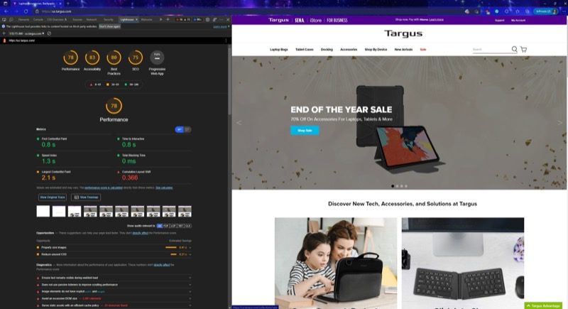
Now that you have a better grasp of what responsive web design is, you should start asking yourself whether your site follows responsive web design best practices. Luckily, Google Chrome and Microsoft Edge have built-in, easy-to-use tools specifically for this purpose. You can press Ctrl+Shift+I to open Developer Tools and then Ctrl+Shift+M for the device toolbar. This lets you toggle views between device widths to easily swap back and forth. From there, you can go to the Lighthouse tab to have Google run a test on how well your site performs. You’ll get a direct score out of 100 and some suggestions straight from Google for how to improve your site. Since Google prioritizes responsive web design for its rankings, you can trust that these suggestions are reliable.
Making Your Site More Responsive
Once you have a firm understanding of what responsive web design is, you can start to improve your site and take advantage of all the benefits responsive web design has to offer.
Typography
When focusing on a site’s responsive design, one of the main attributes to examine is the text. Other elements, media, and blocks may grab the viewer’s attention, but the text is core to most of your site content. In fact, the font you select can have a huge impact on how users respond to your site. To get the best results, you should aim to choose a font size around the baseline 16 px. From there, you can adjust for different screen types with media queries. 16 px is a balanced size that will look decent on many types of screens without need for adjustments.
Images
Images make up another key component of what responsive web design is. Images often take up a large amount of screen real-estate. Without styling, they take up a static value that won’t shrink or grow. So, if your image is 1080px wide, it will be that wide on all screens. It’s a responsive web design best practice to use media queries and breakpoints to scale images across different screen sizes. You can also use dynamic sources for pictures. That is, giving different-sized images depending on the screen size. So, when a 600px width device opens your 1080px image, it will instead be subbed out for a 500px or 600px width image. It will load faster and make scaling easier.
Grid Layout
A grid layout is one of the most important factors of what responsive web design is. A grid layout helps you establish breakpoints and easily format your site content within those breakpoints. So, if you have a single horizontal row with two vertical columns that each take up half the screen on a desktop, you can configure them so the second column rolls over and displays as a second row instead. This makes it easier to take advantage of responsive web design benefits and track how your site should appear when it’s opened on different devices.
Layer Containers
Containers make up another crucial part of what responsive web design is. Containers go above breakpoints to encompass the separate components of your site. Think your header, footer, sidebar, navbar, content, or a separate wrapper. Breaking your site into each of these layers is a responsive web design best practice that makes it easier for you to organize the different parts of a site even after it’s all built. If you want your site to be as responsive as possible, you should also use CSS flexbox. Flexbox offers a flexible way of positioning and scaling web content that will do a lot of the work for you if you set it up correctly.
No Javascript Required
A common misconception among non-developers is the idea that the scaling features that contribute to responsive web design are best done by JavaScript. JavaScript contributes to all the functionality of a site like making buttons work. It can be used to alter the way site content displays, but doing it for simple things like scaling is overkill when CSS enables built-in scaling rules. If you use JavaScript, you have to specify much more elaborate rules to adjust the way certain elements display that will take more power for devices to load. You don’t get any benefits from this approach to responsive web design either. CSS can do everything you need and will be much simpler.
Determining a Media Query Range
When it comes to using your media queries for responsive web design, you need to know the range where your media queries will be active. You can work with whatever screen dimensions you want, but there are some standards for design. For larger devices, you want your media query width to be no greater than 1200 px. For laptops, you can get a little smaller, between 769 and 1024px. Tablets are smaller than that, ideally no more than 768 px. Phones are the smallest, so you should aim between 320 and 480px. Following these pixel amounts are a responsive web design best practice.
Hiding Content
Sometimes your site will have extra content that might best not be the best fit for mobile design. It may make a fine addition to the desktop site, but it takes up too much space for a mobile screen. When you learn what responsive web design is, you can fix this problem by hiding this content. You can do this by establishing a media query for the element that you want to hide and setting it to display as none. When the media query is in effect, that element will simply disappear with no extra styling effort needed.
Examples
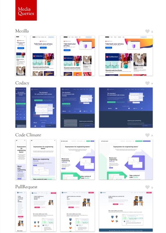
We’ve gone over what responsive web design is, but you may want to see it for yourself to get a better understanding. To do that, you can use a site like mediaqueri.es to see examples of responsive web design best practices in action. You can scroll through to see several live sites that use responsive web design effectively. You even get to view the multiple breakpoints simultaneously to better understand. They also have links to the site so you can play around with scaling in your browser window yourself.
Review
So, what is responsive web design? Put simply, it’s a way for scaling a website easily between a larger viewing window and a smaller one. It’s ideal for having a single site that can accommodate all its users with ease. To check if your site is responsive, you can use Google Chrome’s Lighthouse tool. From there, you have many options for improving the responsiveness of your site. You can adjust text and/or images, use a grid, establish media queries, and even hide unnecessary content. Once you have a good idea of what you want to accomplish, you’ll find it’s not difficult to achieve at all.
For more information on what responsive web design is or anything else relating to web development, follow the BESTWEB blog!