Choosing colors for a website sounds easy enough. Pick a couple that match the brand, put them on buttons and backgrounds, and move on. But that’s how you end up with a site that feels cluttered, inconsistent, or frustrating to use.
The best web design agencies don’t treat color like decoration. They use it with intention. Color shows people where to click, what matters most, and what needs their attention. It signals what’s safe, what’s urgent, and what action to take next. When that logic stays consistent, the whole experience feels natural.
Over time, that structure matters a lot more than whether the palette happens to look trendy this year.
Here’s how strong design teams actually build and use color systems in their work.
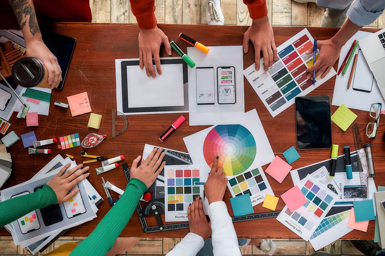
Color Systems Start With Strategy, Not Swatches
Every color on a site needs a job. Some colors highlight actions. Some separate sections. Some warn users before they make a mistake. Without that structure, color just turns into noise.
Research from Nielsen Norman Group shows that consistent visual cues help people move through a site more quickly and with fewer mistakes. When a primary button is always the same color, users don’t have to stop and think. They learn what it means, they know it’s safe to click, and they move forward with confidence.
The best web design agencies define those roles early. They decide what color means “action,” what means “warning,” and what means “background.” Only after that do they refine the exact shades.
Hierarchy Makes Interfaces Feel Obvious
Not everything on a page should compete for attention. Good design makes that clear right away. The most important action stands out. Secondary options are visible but quieter. Supporting details stay in the background. When color is used to reinforce that hierarchy, people don’t have to figure out where to look next, it feels obvious.
This is where many sites fail. If everything is bright, nothing stands out. Users hesitate because nothing guides their eye.
Strong color systems create clear layers. Headlines feel strong. Buttons feel clickable. Backgrounds stay out of the way. The result feels obvious, even if users never notice why.
Accessibility Is Part Of Competent Design

Color has to work for everyone. When contrast is too low, text becomes tiring (or impossible) to read. And if you rely on color alone to communicate meaning, you’re going to confuse some users, especially those with color blindness..
Organizations like WebAIM, World Wide Web Consortium, and the WCAG publish clear accessibility standards. These aren’t theoretical best practices. They exist because poor contrast and unclear cues create real usability problems for real people.
The best web design agencies check their color palettes against these standards from the beginning. They don’t depend on color alone to carry meaning. Instead, they reinforce it with labels, icons, spacing, and layout, so nothing important gets missed.
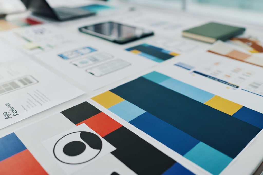
Systems Keep Sites Consistent As They Grow
Most websites do not stay the same. New features get added. Marketing campaigns launch. New teams touch the product. Without a system, colors slowly drift.
One team uses a slightly different blue. Another creates a new button style. Over time, the experience starts to feel messy.
The best agencies prevent this by creating defined color systems. They document exact values and where each color belongs. Designers and developers follow the same structure. That keeps the experience stable, even as the site evolves.
Real World Conditions Change Everything
Colors do not exist in a vacuum. They show up on all devices. The best web design agencies test colors in real conditions. They check how text reads on mobile. They see how buttons look next to real content. They adjust until the interface feels clear everywhere.
This is where experience shows. Mockups can look perfect. Real products expose weaknesses.
Color Systems Improve Over Time
No color system stays frozen. Products change. Brands evolve. User behavior reveals problems.
Smart teams build systems that can adapt. They adjust contrast when readability suffers. They refine emphasis when users miss important actions. The system becomes stronger through use, not weaker.
This is the difference between decoration and design. Decoration looks good once. Design keeps working for years.
The Difference Shows In Daily Use
Anyone can pick attractive colors. The hard part is making color work consistently across hundreds of pages and features.
Strong color systems make products easier to use. Users move faster. They trust what they see. They make fewer mistakes.If you are evaluating web design partners, pay attention to how they talk about color. Our vetted list of the best web design services companies treat color as a functional system that works for you. That mindset leads to websites that stay clear, usable, and effective long after launch.