Design tools are always changing. A few years ago everyone was using something different. Lately though, leading web design tools work in Figma. It’s where ideas get sketched out, screens get built, and feedback happens in real time.
Part of the appeal is simple. You can send a link and everyone’s in the file. No huge exports. No version confusion. It just makes working together easier. And honestly, even before you add any plugins or extras, it’s more than capable on its own.. The real boost comes from plugins. The right ones save time, remove small frustrations, and help teams move faster without cutting corners.
Design isn’t just drawing clean boxes on a screen. Real pages need real content. They need spacing that actually works, images that make sense, and checks to make sure people can use what you built. Plugins handle the repetitive stuff so designers can focus on the bigger decisions.
See the Figma plugins leading web design teams rely on, not because they’re trendy, but because they solve everyday problems.
Bring Content Into Your Designs Early
Blank layouts filled with “lorem ipsum” look fine at first. But they don’t test anything. As soon as you swap in real headlines, real names, or real photos, little issues start to surface. Text wraps in awkward places. Images feel too tight. Spacing that looked fine with placeholder content suddenly doesn’t work
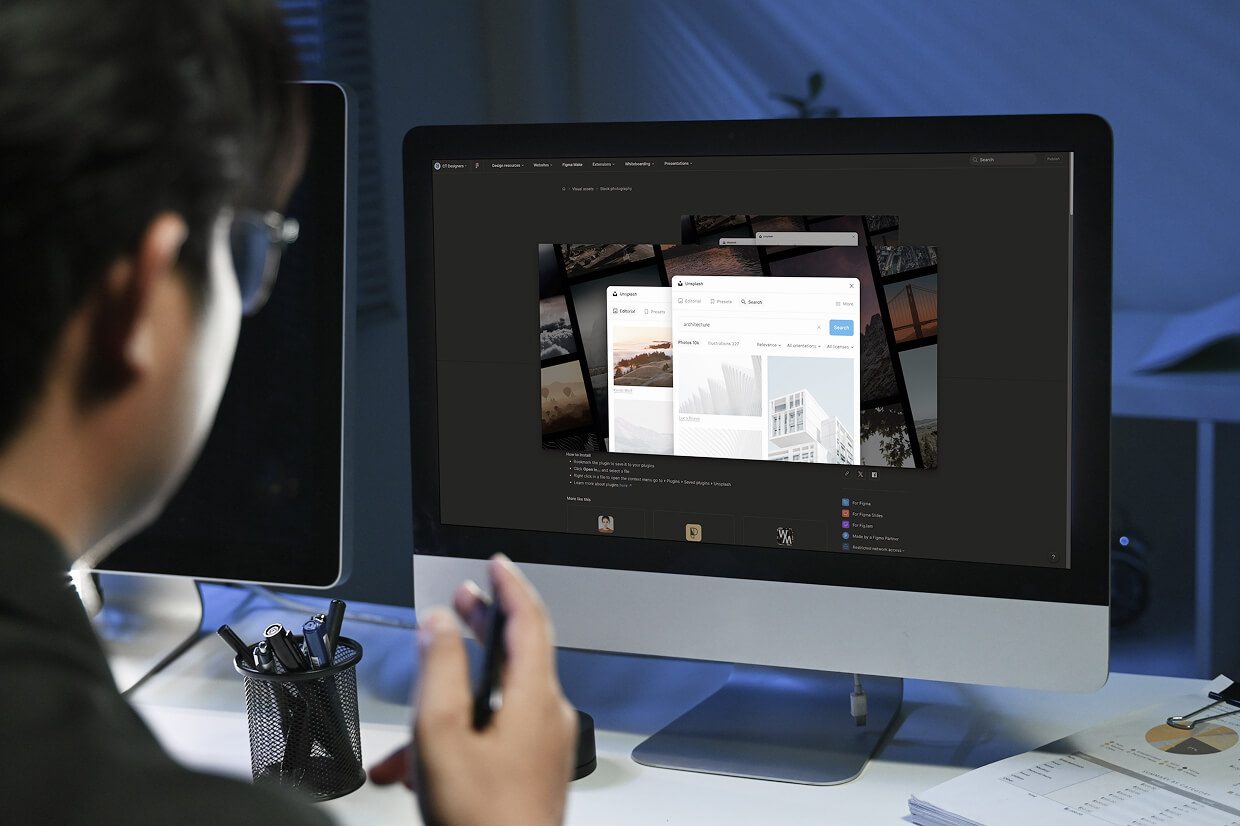
The Unsplash plugin makes that switch easy. It lets you pull real images directly from the Unsplash library into your design. Instead of staring at gray boxes, you’re working with actual photos, which makes the layout feel more real, and a lot easier to evaluate.
Content Reel is another practical tool. It lets you drop in names, emails, phone numbers, and other believable text. Real content stretches layouts in ways placeholder text never will. It forces you to design for reality.
Organize Layout and Flow
Web projects can get messy. Dozens of screens. Multiple user paths. It’s easy to lose track.
Autoflow draws clean connection lines between frames so you can show how users move from one screen to the next. It sounds minor, but when you’re explaining a checkout flow or onboarding sequence, it makes a difference.
Wireframing plugins also help. Instead of rebuilding the same card layout or navigation bar over and over, you can grab ready-made components and focus on structure. It keeps early-stage work quick and flexible.
Icons, Graphics, and Visual Assets
Icons show up everywhere, in menus, buttons, forms, alerts messages. And tracking them down one at a time can eat up more time than you expect. Iconiify makes that part easier. You can search through thousands of icons from major libraries without ever leaving Figma. A few clicks, and it’s in your file. No downloading, no digging through folders.. You search, click, and it’s there. That consistency matters. Clean, consistent icons make interfaces easier to understand.
For illustrations, Blush lets you add customizable artwork directly into a design file. And if you want motion inside your prototype, Figmotion allows you to build simple animations without jumping into another program. It won’t replace a full animation tool, but for basic interactions, it does the job.
Accessibility and Quality Checks
Design isn’t just appearance. Design has to work for real people, not just look good in a presentation. It has to work for real people. Stark checks color contrast and simulates different types of vision. That helps teams catch accessibility issues early instead of fixing them later. Accessibility isn’t a bonus feature. It’s part of responsible design.
Design Lint scans your file for things that don’t quite match, text styles that were applied slightly differently, colors that are off, or elements that were never properly defined.
It’s basically a quiet double-check in the background. The kind that catches small inconsistencies before they turn into annoying fixes later on.
Bridging Design and Development
Some plugins help smooth the handoff to developers. There are tools that export designs into code‑friendly formats like HTML/CSS or React components. They don’t replace developers, but they reduce confusion and speed up alignment.
Other plugins manage color tokens, remove image backgrounds, or organize design systems. The ecosystem keeps growing because real projects are complex, and teams need support.
Practical Takeaways

Plugins won’t magically make a weak design strong. Judgment still matters. Experience still matters.
What plugins do is cut down on busywork. They help you use real content sooner. They keep layouts consistent. They catch mistakes early. That means fewer revisions, fewer developer headaches, and smoother launches.
Teams that rely on these tools don’t treat them like hacks. They treat them like part of their routine. Once they’re built into your workflow, going back feels slow, kind of like switching from fast Wi-Fi to a weak signal.
If you’re not sure which plugins make sense for your team, see our vetted list of leading web design agencies that can guide you on the best Figma plugins for your workflow.