
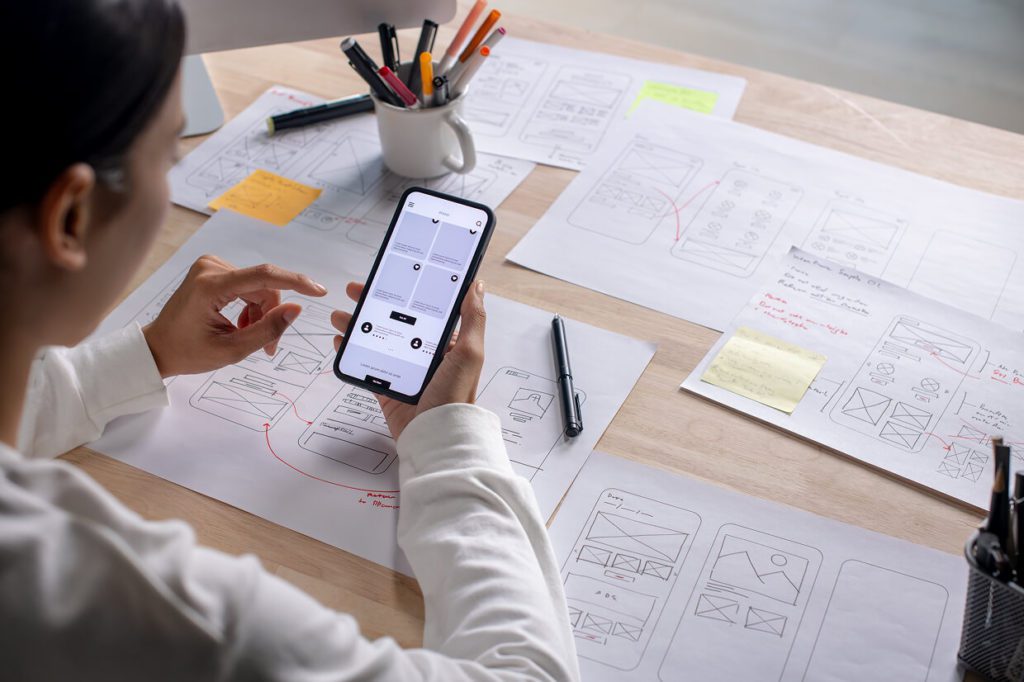
Ever try to explain how a site should behave, only to see it come back looking different or worse? That usually happens when teams jump straight from concepts to code. The best agencies stop that problem early with prototypes: sometimes as simple sketches on paper, other times as polished, clickable mockups. Prototypes are faster and cheaper to adjust than code, which makes them the perfect tool for catching usability problems before development even starts.
Take a SaaS startup building a sign-up flow. A quick prototype test shows users stumbling on password requirements and abandoning the form. Fixing that in design takes minutes. Fixing it in development could take days. Or consider an ecommerce brand preparing a new checkout process. A clickable prototype reveals that shoppers keep missing the guest checkout button, which would have led to lost sales. Because the issue surfaced in prototyping, developers didn’t waste cycles coding and recoding the flow.
That’s why agencies lean so heavily on this step. Prototypes reduce rework, improve clarity for developers, and help clients see what a site will do, not just what it will look like. The investment in time and tools pays for itself. This blog delves into the specific ways the best web agencies use prototyping tools to save time, cut costs, and deliver better sites.
Why Prototyping Saves Time and Money
Clickable or high-fidelity prototypes show where users hesitate, get confused, or drop off. For example, the Nielson Norman Group’s (NNG) redesign of its own homepage used at least two rounds of prototype testing to fine-tune navigation flows. That resulted in fewer bugs later, shorter QA periods, and better clarity for developers.
Also, simple methods such as paper prototyping or low-fidelity wireframes often catch layout and structural problems at almost no cost. Jakob Nielsen’s article “Paper Prototyping: Getting User Data Before You Code” shows how early testing (before visuals even get polished) saves time and money.
Figma: The Shared Workspace That Speeds Feedback
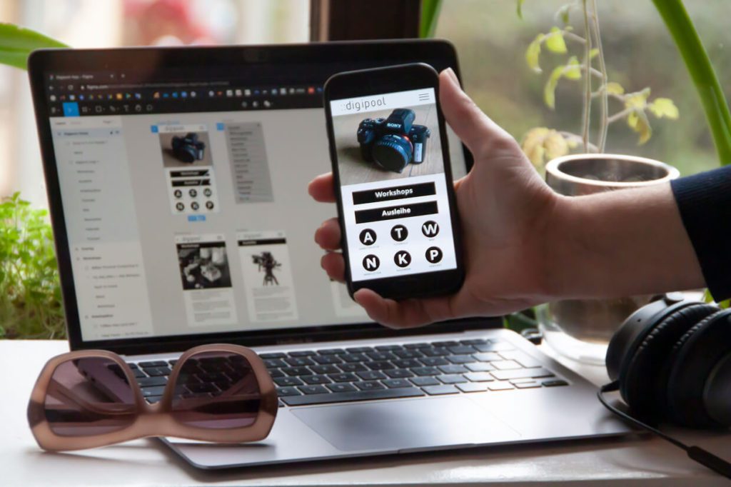
Cloud-based tools have changed the game. Figma lets designers, developers, and clients look at the same evolving design, leave comments, make tweaks in real time. That eliminates email chains, version mismatch risks, and miscommunication.
Best web design agencies use it from early wireframes through to handoff. They also integrate plugins (for redlines, specs, asset extraction) so that developers can inspect details directly and don’t have to wait for completed mockups.
When Adobe XD and Sketch Make More Sense
Not every project or team wants the same tool. Web design agencies already deep in the Adobe creative universe often lean on XD because switching costs are high. XD’s voice prototyping, auto-animation, and shared components are useful for certain interactive, media-rich sites. Sketch remains strong among teams on Mac, especially when paired with tools like Zeplin or Abstract for version control and asset handoff.
Simple projects such as a brochure site, or landing page, the speed of Sketch or early XD mocks may outweigh starting in Figma for some teams.
High-Fidelity Prototypes With Webflow, Framer, etc.
When complex interactions are involved as with validation forms, hover states, animations, and responsive behavior, high-fidelity matters. Best web design agencies sometimes build prototypes in Webflow or Framer so the prototype is close to final product behaviour. That helps stakeholders test real interactions rather than imagine them.
How Many Participants? What Kind of Testing?
Misconception: more people always means better results. Reality: testing with five users often uncovers most of the major usability issues. Testing with five participants in a qualitative usability study of a single user group can identify the common problems in a product.
Also, best web design agencies plan for multiple test rounds. They gather both qualitative feedback (where users struggle, what they expect) and quantitative metrics (time on task, completion rates). That lets them decide what changes actually improve usability rather than guess.
Real-World Example: NNG Redesign Case Study
When NNG redesigned its homepage, it didn’t just update visual design. The process started with audits, then prototype testing (low fidelity → high fidelity), then usability testing, then specifications. Key findings: slight navigation tweaks improved click-through to resources by measurable amounts. They found that even “obvious” things (navigation labels, headline wording) often hide misunderstandings until real users test.
Want an agency that runs prototyping like this, not just draws nice mockups? Have a look at our list of verified web design agencies and pick a team that treats prototypes as essential to creating sites that work, not just look good.