Most web traffic now comes from mobile. According to Statista, mobile devices account for over 58% of global website traffic as of early 2025. In some sectors like food delivery, retail, or local services, that number can go past 80%. If your website feels slow or clumsy on a phone, it’s not a small mistake, it’s a fundamental failure in planning.
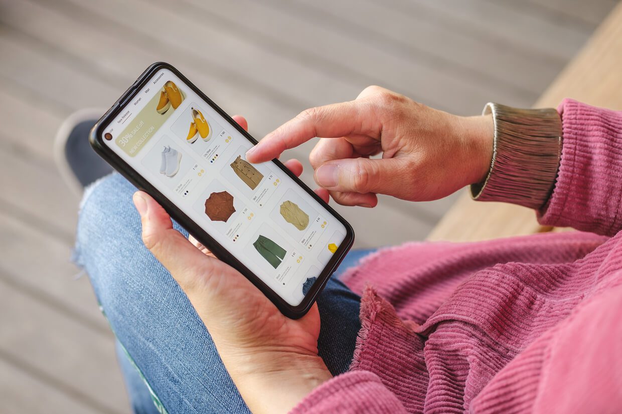
Top agencies flip the typical process. Instead of designing for desktop first, they focus on mobile-first UX. This means making design decisions for small screens with short attention spans and limited connectivity. Then they scale up to bigger screens, not the other way around.
Start With Real Constraints, Not Just Screen Sizes
Mobile-first design starts with hard limitations, which forces clarity. There’s no room for clutter, vague navigation, or unnecessary animation. Every element has to justify its existence. As Luke Wroblewski, author of Mobile First, puts it: “Designing for mobile isn’t just about screen size, it’s about mindset.”
Top designers begin with user goals. What task are they here to complete? How quickly can it be done? What can we eliminate without reducing value? The best agencies use these answers to build structure, not just layout.
Design for Fingers, Not Cursors

Many websites still treat phones like tiny desktops, i.e., buttons are too small, hover states are broken, and dropdowns are a mess on touchscreens. A mouse click is precise, a finger tap is not. So buttons need to be larger, at least 44px by 44px, per Apple’s Human Interface Guidelines. Hover menus don’t work on touchscreens. Dropdowns often malfunction on Android browsers. These things still show up in far too many sites.
Instead, smart teams build with touch in mind. Buttons are spaced for thumbs. Important actions aren’t crammed into the corners. They support gestures like swipe or tap, but always include backup options. And they test these choices on real devices, not just desktop simulators.
Speed Isn’t Optional, It’s Design
How fast your site loads is part of the user experience. Mobile users notice every second. Good agencies design with performance in mind. Google’s 2024 Core Web Vitals update penalizes slow mobile pages in search rankings. Agencies that take mobile UX seriously measure speed in milliseconds. They strip unnecessary scripts, avoid heavy media, and load assets progressively. That means fewer assets, compressed media, and no bloated code.
They also work with developers who understand mobile performance early, not after design is done. A beautiful mockup doesn’t matter if it loads in six seconds. Users expect sites to load in under 2.5 seconds, according to Google benchmarks. Anything slower leads to drop-offs.
Show What Matters, Skip the Rest

On mobile, there’s no space for clutter. There should be one goal per screen, clear actions, and clean visual hierarchy. That’s how people get things done.
Overlays, filters, and menus are planned like storyboards. Every tap should move the user forward, not bury them in layers.
Make It Native to the Device
The best mobile sites behave like mobile apps. Location buttons trigger maps. Phone numbers initiate calls. Forms auto-fill and support mobile wallets like Apple Pay. Users expect mobile sites to behave like the apps they already use. Design choices should reflect that.
Good UX teams study how users behave on their phones, not just how designs look. They use platform conventions, like swipeable carousels or sticky headers, and ensure they don’t block core interactions like scrolling.
Test With Real People
Lab tests don’t catch everything. People hold phones differently, get distracted, and often don’t scroll as far as you think. The best agencies watch real users try real tasks on real phones. They watch for hesitation, frustration, and patterns of abandonment. They learn from mistakes, hesitations, and drop-offs.
No test script can replace watching someone get frustrated trying to hit a tiny button on a moving train.
Content Needs to Be Mobile-Ready Too
Good teams work with writers from the beginning, as mobile content needs to be short, clear, and helpful. Nielsen Norman Group recommends front-loading important words and using clear subheadings. Long paragraphs and vague headlines don’t work on 6-inch screens.
Great content uses short sentences, bullet points, and clear next steps. This also includes microcopy: button labels, error messages, form field hints. These tiny pieces of text often decide whether users convert or leave. Great agencies know when to avoid filler and jargon.
Good Design Is About What You Don’t Do
Top agencies avoid gimmicks and know better than to resort to tricks. Great mobile UX is often about removal. Smart teams cut autoplaying video, full-screen popups, overlong forms, or anything that interrupts natural scrolling. They test decisions with data. What’s removed is just as important as what stays.
In mobile design, less is almost always more, but only if it’s strategic. Random minimalism doesn’t help users; intentional, informed simplicity does. Top agencies know what slows people down and cut it out. Mobile UX isn’t just about adding features, it’s about removing friction.
What It Comes Down To
Top web design agencies don’t treat mobile UX like a checkbox. They build around it. They know what works, and they’ve made the mistakes already. You’re paying for that experience.
If your current team still puts mobile second, you’re leaving users behind. Want to work with people who get it? Explore our list of qualified and competent web design agencies that prioritize user experience and deliver tangible results.