A great navigation system is the backbone of your website. It guides your customers along their journey toward checkout and also informs your overall business website design. Many people don’t realize that intuitive navigation is not just for human users; it’s also used by search engines to index and understand the overall structure of your website and how each page is related to the others.
Use this guide to fine-tune your website navigation to improve the user experience (UX) and your SEO performance.
The 3 Basic Principles of Functional Navigation
Your navigation should follow a customer-centric philosophy. That means the ultimate goal of any change to your navigation should be about improving the overall user experience of your business website’s design.
94% of customers agree that easy navigation is a must-have for a reliable business. Create an unbeatable UX, and the search engine performance will follow naturally. Ineffective navigation often stems from businesses treating their navigation as an organizational system for themselves rather than for their customers.
- Convenience: Terrible website navigation is needlessly difficult. If your store sells a large number of products with distinct attributes, allow your customers to filter your products by those attributes.
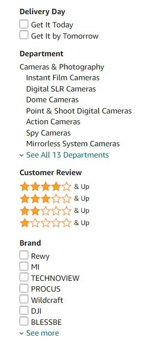
A simple filtering sidebar for easy shopping
Category links can also increase average order values as customers will have to go through other products to find what they’re looking for. In fact, a study reveals that users who started with a category link ended up looking at almost 10 times as many product pages as compared to those who started with a manual search.
- Design Clarity: Your navigation should reflect your website’s purpose. Visitors should be able to determine what your business is about and what your website can do for them with the help of clear design. Transparent navigation establishes credibility and builds a long-term relationship with each visitor. Gain their trust with a great first impression and you won’t have to work as hard to win repeat customers further down the line.
- Circular Navigation: Customers don’t follow a linear path of homepage->category page-> product page to make a purchase. Great website navigation should make it easy for customers to find what they’re looking for, no matter what page they started from.
There are multiple ways to make life easier for your customers while also strengthening your brand. Fashion retailers that offer a large number of products often include a sticky menu that stays with users as they scroll down and explore different products, making it easy for them to click on a different category without having to go back up.
One of the best examples of customer-friendly business website design is breadcrumb navigation. This tiny addition to your pages instantly lets your users know where they are on your website and allows them to get around with a single click.

How To Elevate Your Website Navigation
Once you’ve established the foundations of a great navigation system, you can customize it to create a UX unique to your business website with clever design.
- Brand-Specific Design: In a study, 1 out of 4 people failed to successfully navigate a website that used generic labels. If you just have “resources” and “services” in the top menu, it’s not always clear what falls into those categories. Keep in mind that your UX is a reflection of your brand’s ideals and style. Is your brand “generic?” Probably not—that’s why your site needs brand-specific design.
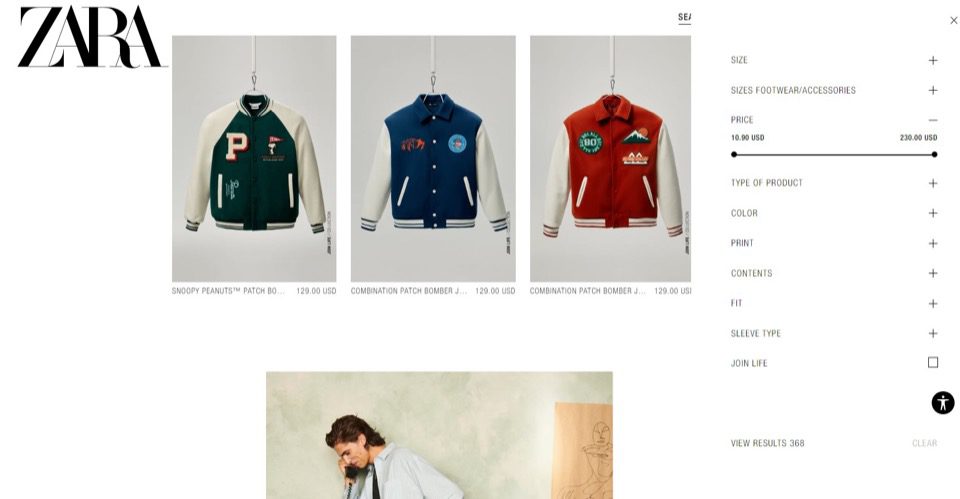
Most fashion and lifestyle brands like Zara are great examples of this philosophy. Sleek, minimalist designs with light colors and minor animations are the dominant trend in web design right now—and for good reason. Customers treat these cohesive designs as an indicator of the brand’s quality, including the products on display.

This no-frills business website design places all-important category pages front-and-center, while drawing the eye to the CTA.
- Facilitate Conversions: Your website’s navigation isn’t just a way for your customers to get from point A to B. It’s also a tool that can facilitate conversions. Make purchases easier with internal linking and well-placed calls to action.
For example, a well-placed link on each product page that leads customers to other relevant category pages can incentivize them to order more products at a time, seamlessly boosting average order values with minimal investment.
- Optimize for Mobile: Businesses must know their audience before designing a website. 59% of all web traffic came from mobile users in Q2 2022. Optimize your navigation for multiple devices by making use of white space, readable fonts, and compressed images for faster load times.
Using your desktop layout for mobile pages can be a frustrating experience for your users and will quickly drive away a significant chunk of potential customers.
- Responsiveness Matters: Responsive navigation is a must-have whether that’s on desktop or mobile. It’s not enough for your images to load fast. Menus should be snappy, animations shouldn’t lag behind, and links should be easy to locate and click.
Improving Business Website Design with SEO
A better user experience is deeply connected to SEO. Your business can reap the dual benefits of better usability and discoverability by considering SEO while designing your website’s navigation.
The First Link Advantage
Some experts believe that on a website containing multiple links to the same page, only the first link will be considered by search engines. The problems with this become apparent when we look at how a page is created.
Normally, developers tend to put navigational elements like the sidebar before anything else in the source code when designing a business website. Anchor text in sidebars and topbars is usually designed to be short and snappy without much emphasis on keywords. The main content of the page, whether that’s a blog or product, is where the links that incorporate keywords go.
Due to this duplication, the search engine looks at non-optimized links in your navigation bars and ignores the keywords. Thankfully, the solution to this website problem is easy for businesses to design around: you just have to put the main content above the sidebar elements in your source code. Now, you can still have that snappy website navigation while still reaping the SEO benefits with keyword-optimized links.
Rely On User Analytics
Monitoring the customer journey with Google Analytics will show you how users navigate your website and what to optimize for. The ‘Users Flow’ feature in the Audiences tab is a brilliant way to understand a visitor’s journey through your website at a glance. The feature gives you a snapshot view of the first page that visitors land on and the actions they take afterward. You’ll also be able to review user behavior on their subsequent visits.
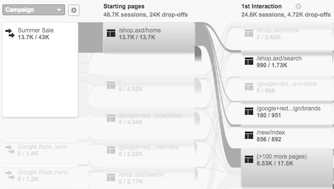
Source: Google
Observing user behavior with analytics gives you insight into how effective your business website’s design is at guiding customers to conversion. If your navigation works well, users will have no issues taking a predictable path from, say, a landing page to the product. If your visitors are displaying an unfocused trend of hopping from page to page and eventually clicking off, it could be a sign that your website navigation isn’t doing its job.
Consider using the Site Search Overview feature to find out what your users are looking for. This feature reveals what visitors search for after clicking on your site, along with the exit rates after a search. High exit rates are an indication that users are having difficulty finding what they’re looking for even after specifically searching for it.
Make it easy for them to find those pages by optimizing for targeted search terms and driving those exit rates down with effective business website design.
Clear Anchor Text
If a user doesn’t get what they were expecting after clicking a link, they’ll be quick to leave. Your anchor text should be accurate, and if possible, you should also align that text with relevant keywords. Doing this successfully requires detailed keyword research, as there can often be a significant disconnect between the business and the user in terms of website navigation.
Your team might decide on using jargon like ‘Project S’ for a stapler, but your customers won’t know what that is and click off the page immediately, even if you’re selling exactly what they’re looking for. Keyword research won’t just tell you what your potential customers want, it’ll also guide you towards high search engine rankings with effective long-tail keywords.
This will help search engines understand your website’s internal structure and improve the overall quality of web traffic.
Improve Crawlability
Most business website designs follow a hierarchical content structure. Your homepage leads to multiple category pages, which then are connected to numerous subcategory pages (i.e, product pages). Such a structure forms a content cluster that the search engine considers homogenous. Thus, each cluster is crawled at a different rate depending on internal linking and the traffic that it gets. This can have notable implications for website navigation.
This structure works well when traffic is uniform across all of your clusters, but this is rarely the case. What tends to happen is that one cluster eclipses the rest in traffic and search engine rankings, while the others don’t gain at all. This is primarily because of the lack of links between the well-ranked cluster and the others. For example, a stationery store wouldn’t normally think to include links to staplers on a product page for pens, even if pens were their most popular category.
The answer to this design problem is horizontal linking across your business’s website. Interlinking different clusters helps spread the benefits around, this can be done by identifying relevant common points between two different categories and adding a link to connect them. You’ll often see this being done with blog pages that link to product pages and vice-versa.

A product page description that contains links to other relevant category pages
Horizontal linking flattens the hierarchical structure of your website and makes it easier for search engines to crawl it.
Navigating To Success
A great website navigation system lays down the foundation for your business’s future growth. Follow these tips to craft a flawless UX that keeps customers coming back for more. For more quick guides on how to boost your business with better website design, follow BESTWEB.