

Put three finished homepage designs in front of a client and you’ll usually get the same response. They like the header on the first one. The colors on the second. Maybe the buttons on the third. Can you combine them? Samantha Warren, who introduced style tiles in a 2012 A List Apart article, saw this happen often enough to give the result a name: the “Frankencomp.”
Her point was that clients end up picking pieces they like instead of judging whether the design does what the site needs to do. Style tiles were her answer. A tile is one board with fonts, colors, and a few interface elements on it. It shows how a brand might feel on the web, but there’s no layout.
Making one isn’t hard. Presenting it so the client actually makes a decision is harder. This article looks at how leading web design companies approach style tile presentations, and why the way a tile is shown matters as much as what’s on it.
A Style Tile Sits Between a Mood Board and a Mockup
Warren described the tile as more refined than a mood board but less detailed than a full comp, and she delivered it alongside the site map and wireframes. She compared it to how an interior designer works. They bring paint chips and fabric samples to the first meeting. Nobody furnishes three versions of the living room.
That in-between spot is why tiles work. Mood boards tend to be too loose for most clients to picture an actual website from. Comps go the other way. They look so finished that people start reacting to details nobody has decided on yet.
A tile only asks one thing: does this look and feel like us? It helps to say that plainly before the tile even goes up on screen. If a client thinks they’re seeing the homepage, they’ll review it like a homepage, and the meeting drifts toward the wrong conversation.
Framing the review correctly sets expectations: remind clients that style tiles present visual language rather than layout, preventing early critiques on element placement.
The Best Presentations Quote the Client Back to Themselves
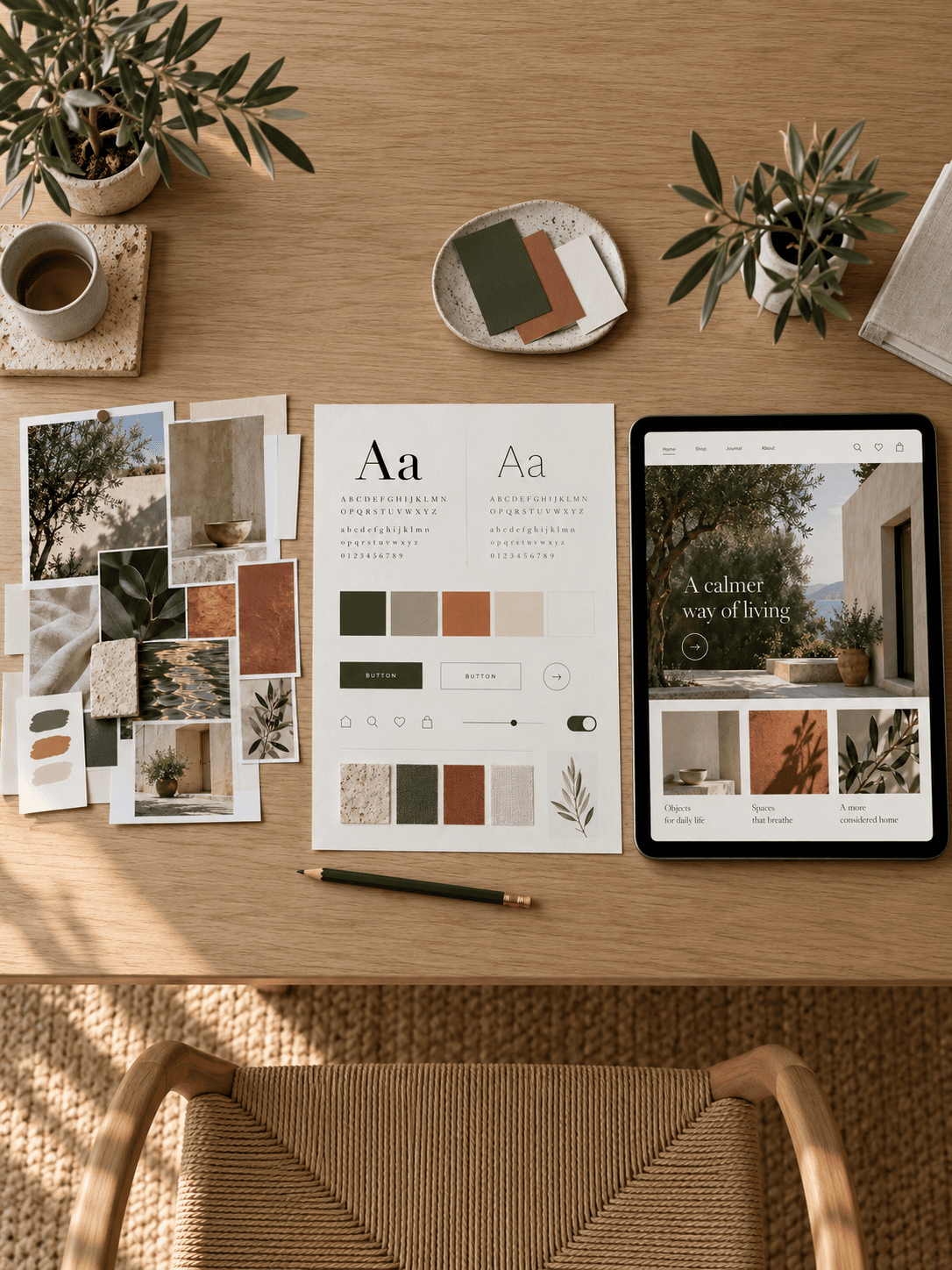
Warren’s process starts well before design, with questions meant to get stakeholders talking in adjectives. One of her suggestions was a metaphor prompt: if the website were a vehicle, what would it be? She also used semantic differential scales, where clients mark where the site should sit between two opposites, like modern and old-fashioned. Whatever words keep coming up end up steering the design.
This is where the prep pays off. Say the client used the word “friendly” at kickoff. Now the presenter can point at the rounded typeface and the warmer colors and tie them straight back to that word. Warren found that the more literal the connection, the more connected the client feels to the process, which builds trust and makes approval smoother.
Some teams borrow a tool from UX research to keep the language from wandering. Microsoft’s Desirability Toolkit, from 2002, includes a list of 118 product reaction words, and Nielsen Norman Group suggests adapting and shortening it in most cases. Working from a short shared list means “clean” means about the same thing to the marketing director as it does to the CEO. That alone heads off a lot of back-and-forth.
Three Options Work When They Share the Same Foundation

The best documented example comes from Warren herself. Her team designed a 2012 election microsite for The Washington Examiner. The word “patriotic” led to red, white, and blue, and the paper’s publishing history pointed toward slab serif type.
Three more words, “clean,” “strong,” and “friendly,” each got their own tile. The clean one was bright with lots of white space. The strong one used brushed aluminum and the stars from the logo. The friendly one had big hits of vibrant color.
The client chose the first tile, then asked for the red stars from the second and the typeface from the third. They eventually landed on a slab serif called Adelle, and according to Warren, that final tile carried straight through to the finished site.
So the client mixed and matched anyway, which is exactly what goes wrong in comp reviews. It went fine here for two reasons. Swapping a swatch takes minutes, not days. And since all three tiles came out of the same brief, the borrowed pieces actually belonged together.
A Palette That Fails Contrast Was Never Really Approved
Color is one spot where tile reviews can slip. Everyone signs off on a nice row of color chips, and then the palette falls apart the first time somebody puts body text on it.
WCAG sets a minimum contrast ratio of 4.5:1 for text, and 3:1 for large text. The W3C is strict about those numbers, too. A ratio of 4.499:1 doesn’t get rounded up. It fails. The 4.5:1 level accounts for moderately low vision, color deficiencies, and the contrast sensitivity people tend to lose as they age.
A careful team runs those checks before the meeting and shows real text and buttons sitting on the proposed colors. If the brand blue can’t hold white text, the client should find out during the tile review. Finding out in development, after they’ve grown attached to that button, is a much harder conversation.
An Approved Tile Should Point to What Comes Next
Warren saw the approved tile as a starting point for other design assets, such as component style guides for frequently used elements. She also thought it suited responsive projects better than mocking up every screen size. That means a good presentation should wrap up by being clear about what’s been decided and what hasn’t. Type and color direction are set. Layout, real content, and page hierarchy still get worked out in wireframes and mockups.
Tiles do have a blind spot, and one reader called it out in the comments under Warren’s article. The example tiles had no real content in them, and the commenter’s own team had switched to designing around real content in every phase. Fair enough. A tile can’t show what happens when the CEO’s favorite headline wraps to three lines.
That’s okay, as long as someone says so before sign-off. If nobody does, the client leaves thinking the hard part is over, and the first mockup review gets awkward.
Testing visual elements against realistic character lengths and word counts during the tile phase helps ensure typography holds up under actual content constraints.
What to Ask Before Hiring a Web Design Team

Here’s an easy first question: can they show you an old style tile next to the live site it turned into? Agencies that use tiles regularly will usually have one handy. If the tile and the site look like they belong to different projects, the tile probably didn’t drive much.
Next, ask how they collect input before designing. Listen for specifics, such as a kickoff survey, word pairs you rate on a scale, or a short list of adjectives. “We’ll pull together some inspiration” is vague, and vague input usually leads to vague tiles.
Ask how many directions you’ll see, too. Two or three is normal. Go much past that and you can drift back into Frankencomp territory, just with smaller pieces.
One more that people tend to forget: when do they check color contrast? If the honest answer is “during development,” the palette you approve might get quietly changed after you’ve signed off. A style tile is a small deliverable with a big job. It gets everyone agreeing on how a site should feel before layout work starts eating into the budget, and how well it does that has a lot to do with how it’s presented and whether the colors still work once real text sits on them. A good team won’t be thrown by any of this. Browse our vetted list of web design agencies to find a team that understands how to present style tiles.