Customers abandoning their online carts is a sign that something may be wrong with your ecommerce site. What should be a regular flow of browsing a site, adding items to a cart, and entering payment information can be interrupted for many reasons. You can optimize your ecommerce checkout page to enhance your customers’ experience and ensure a smooth transaction.
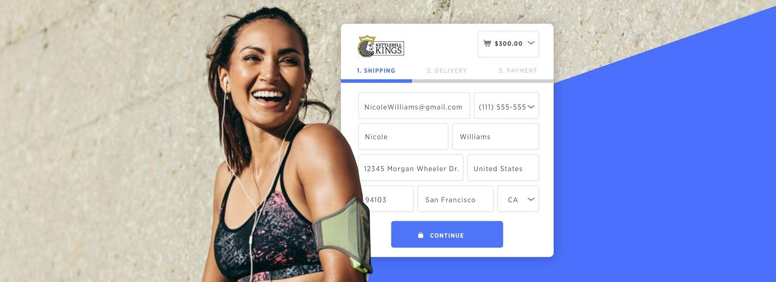
One-Page vs. Multi-Page Checkout
A checkout page is shown to shoppers during the ecommerce checkout process and designed as a one-page checkout or multi-page checkout. You can find the pros and cons of each below.
One-Page Checkout
Pros: Customers are able to see the entire purchase process, including how many steps they have left. Shoppers are also less likely to leave the cart due to page loading time since they don’t have to wait for multiple pages to load.
Cons: Depending on the type of data you are trying to collect, one-page checkouts can be rather difficult to design. The page can come off as cluttered and overwhelming if there are too many required fields to fill in. An off-putting design may also result in shopping cart abandonment.
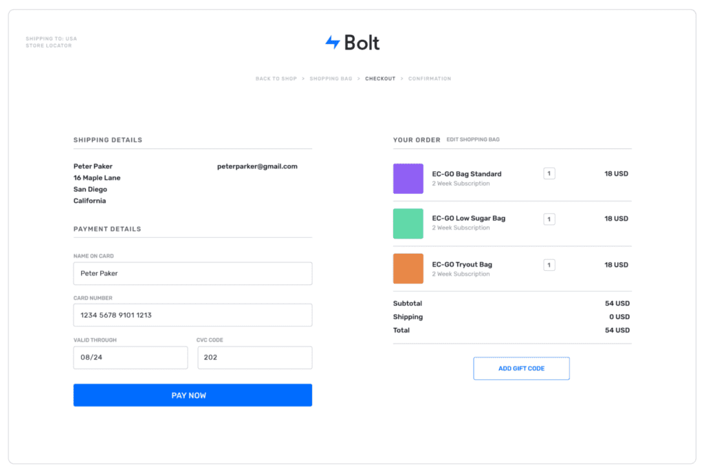
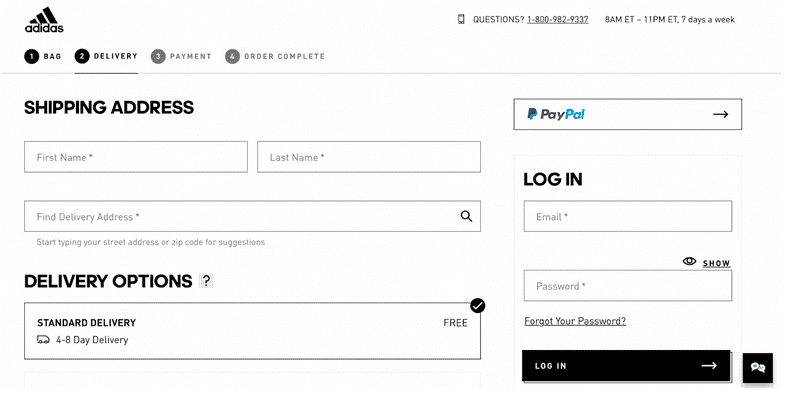
Multi-Page Checkout
Pros: Typically the design is clean and minimalistic giving off an impression of how quick the checkout process is. You are also more likely to collect customer data even if the shopper abandons the cart at a later stage.
For example, if you first ask for the customer’s email address and they continue to the next step before abandoning, you still collect their email. You can use their information to retarget customers by sending abandoned cart emails.
Cons: The multi-page ecommerce checkout process may seem tedious causing shoppers to abandon their carts.
How to Optimize Your Checkout Page
Now that you have an idea of which checkout page works best for you, take a look at the following ways in which you can optimize it.
1. Ensure it’s Mobile-Friendly
It’s vital to ensure your ecommerce CMS is mobile-friendly. As of April of 2020, internet users spent an average of 4.3 hours a day on their mobile devices. That means many of your potential customers will be browsing your site on their phones, and your site needs to be able to accommodate a variety of different mobile devices. It also needs to be ready for multiple mobile-exclusive browsers. If your ecommerce checkout doesn’t work with phones, you have a real problem that may require a more robust CMS, such as BigCommerce.
2. Add a ‘Save Shopping Cart’ Option
Another way to increase the ease of use in the best checkouts is to limit requested information on behalf of the consumer. Think about what information is necessary to ensure the sale and shipping and scrap everything else. The sooner a customer can finalize their data, the sooner they can hit that “order” button. Shopify offers a compact checkout solution that they say is 60% faster than other checkouts on average. In this case, time is money.
With so many consumers having busy schedules and multiple distractions, they can often be easily pried away from your checkout. Cart saving is extremely important for this reason, especially for mobile users. Imagine the frustration of answering a phone call and returning to your cart, only to find it empty. Sometimes consumers may not bother refilling the cart! Being able to create wish lists or save carts the users have filled ensures that even after a distraction, the items they are interested in are waiting for them. So be sure your ecommerce checkout has the option to save consumer carts.
3. Create an Organized and Robust Web Design
A clean design for an ecommerce CMS is one of the best checkout practices you have available. You need to make sure that your checkout process not only looks good but seems organized as well. It should guide the consumer through shopping to transaction as efficiently as possible. That will mean robust web design — which is often a result of working with a dedicated web designer. It is not just your checkout alone that matters, however. Be sure your business website hits our top six web design principles, especially including the checkout and order confirmation pages.
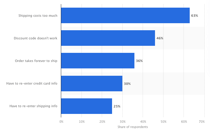
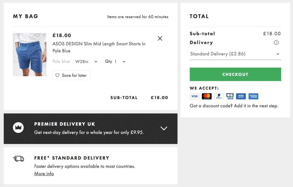
4. Be Transparent About Fees
Nothing can motivate a consumer to “abandon ship” quite like seeing their cart full of items — plus hidden fees. Providing accurate pricing during the browsing process is important because many consumers may not factor in sales tax and shipping as they add items. Giving notice of such fees during the shopping process, or even removing them when you can, is an excellent ecommerce checkout solution to drive sales.
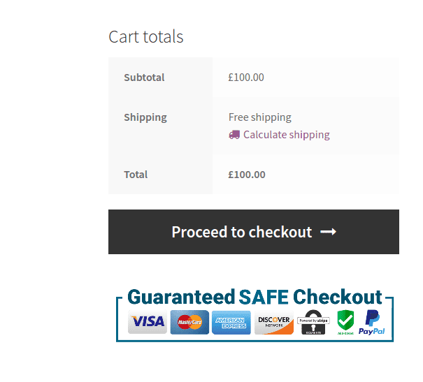
5. Help Shoppers Feel Secure
You should remain vigilant about your website’s security. In 2016 alone, Google reported that 61% of web admins were unaware that their websites had experienced malicious attacks or hacks. Give yourself and your customers ease of mind by displaying your security seals and badges on the checkout page. These seals and badges help boost your customers’ confidence that you’ve done the appropriate work to ensure their safety by taking security on your website seriously.
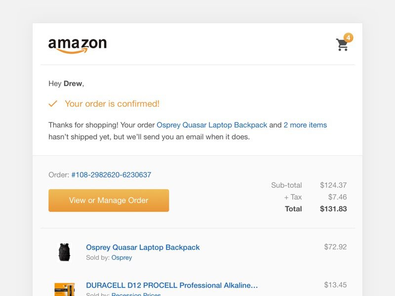
6. Send Notifications and Verifications
Notifications and verifications that keep consumers apprised of changes to their checkout process or any errors in their provided information are vital to proper ecommerce. Providing real-time form field validation can quickly help customers fix errors before they potentially lose track of them. Ensure that your checkout also provides notifications via email as orders get placed and payments are confirmed. These notifications cover everyone in the transaction and also create peace of mind in the consumer.
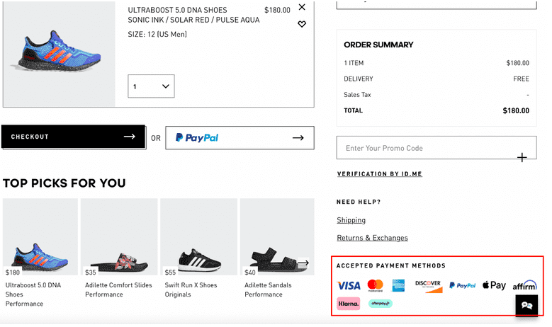
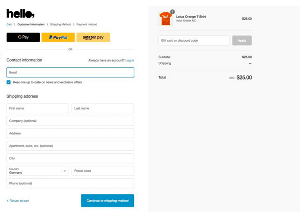
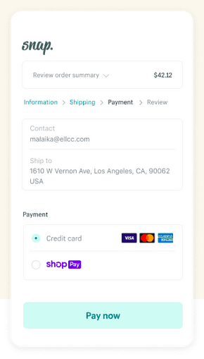
7. Offer Multiple Payment Options
At checkout, to ensure your best chance at sales, your CMS should handle multiple payment methods. Do your research on your payment methods, however. Keep an eye on what payment systems are viable and make sure your ecommerce checkout can accommodate them. Don’t be afraid to try new payment methods as they arrive, once there’s reasonable evidence of their effectiveness and security. Remember, PayPal was new once.
Being flexible when it comes to registration is also essential when it comes to your best checkout solutions. Allowing for guest checkouts and social media signups will ensure the broadest potential consumer base can use your system and move to the transaction stage. Requiring customers to register to finish their purchase disrupts the sale flow and may give them time to rethink their purchase. Allowing people to register on your site quickly and with little fuss, such as with the use of social media, helps any registration to be a minor distraction at most.
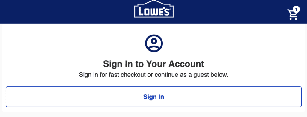
8. Have a Guest Checkout Option
Users often expect a guest checkout option and may abandon the cart if they are required to register. Consider asking users to log in via Gmail or their social media accounts to increase the number of purchases.
Can You Achieve a Great Checkout on Your Own?
The right content management system can be difficult to choose. Ultimately, your CMS will need to provide you with the flexibility to ensure your ecommerce checkout carries consumers through to the purchase. Unfortunately, those CMS solutions can be hard to explore by yourself. You don’t have to find your solution alone, however. Working with a strong web design company with experience in the best checkout solutions might be your best option. If you have questions about the various design firms listed on our site, why not contact us with your questions? We’ll be happy to help in any way we can.
Banner image source: BigCommerce